How to Add a Trendlline in Google Sheets
The purpose of a trendline is to highlight the patterns in data. They are useful parts of certain charts on Google Sheets. So, you must first insert a chart in Google Sheets to insert a trendline. We show you the steps below.
Adding the Chart
Step 1: Open Google Sheets in your preferred web browser.
Step 2: Create a new workbook and enter your dataset for the chart or open an existing workbook with the dataset.
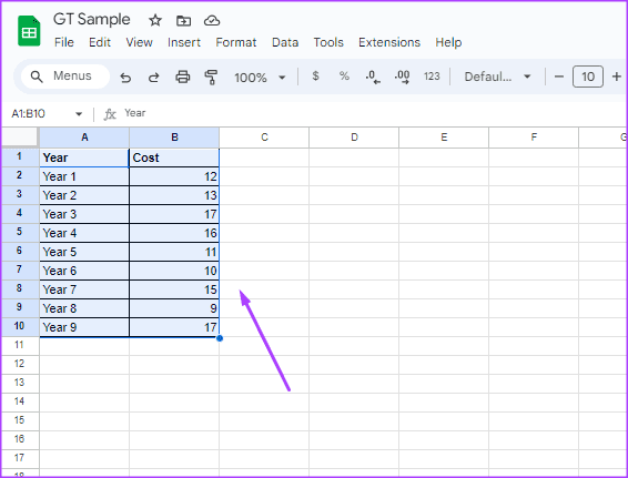
Step 3: Select the cells you would like to include in your chart.
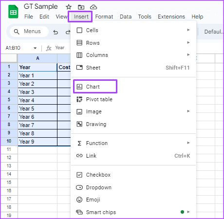
Step 4: Click the Insert menu at the top and select Chart from the context menu. This will launch a Chart editor on the right of your spreadsheet.
Step 5: Click the drop-down beneath the Chart type on the chart editor.

Step 6: Select your preferred chart type from the chart editor. You can add trendlines to a bar, line, column, or scatter chart.

Adding the Trendline
After you insert your preferred chart type into Google Sheets, here’s how you can add a trendline to it:
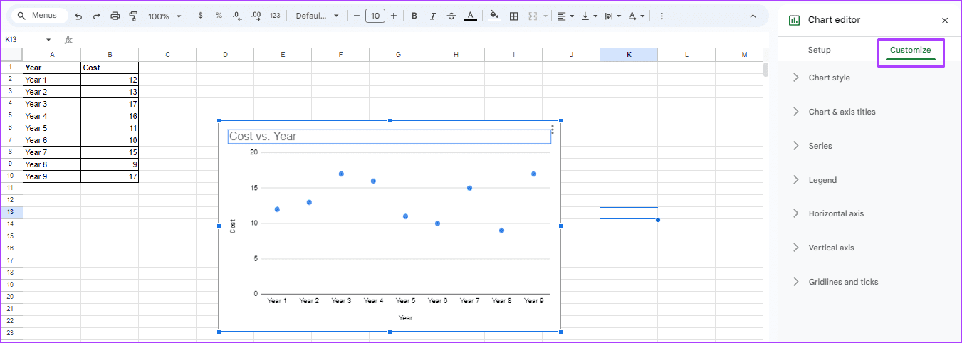
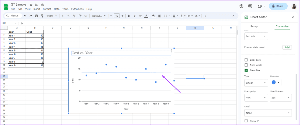
Step 1: Double-click the chart you want to add the trendline to. This will launch the Chart editor on the right side of your spreadsheet.
Step 2: At the top of the chart editor, click the Customize tab.
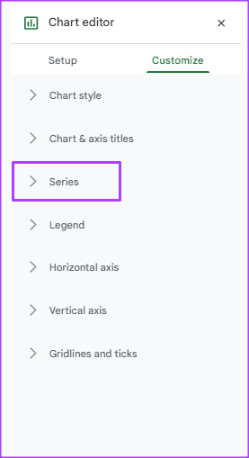
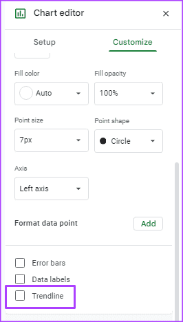
Step 3: Select the Series drop-drown.
Step 4: Tick the box beside Trendline. You will see a line appear in your chart.
Now, you should see the trendline appear on your chart.
How to Customize a Trendline in Google Sheets
After adding the trendline to your chart, you can make changes to its appearance to customize how it appears in Google Sheets. Here’s how to do so:
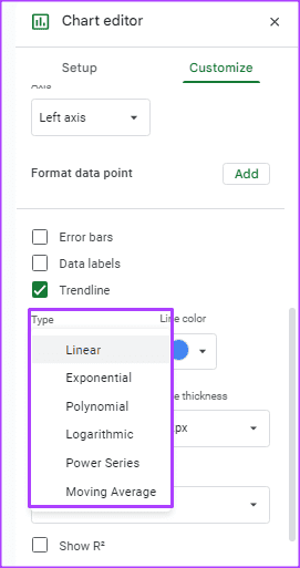
Step 1: Under the Trendline box, you will see Type. Click the drop-down beneath Type to choose your trendline’s form from the following options:
- Linear: best for data that flows in a straight pattern
- Exponential: for data that rises and falls proportional to a value
- Polynomial: for data that has a varied pattern
- Logarithmic: for data that falls or rises and then flattens out
- Power Series: for data that falls or rises proportionally to its current value at a uniform rate.
- Moving Average: for data that is unstable
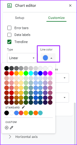
Step 2: Click the drop-down beneath the Line color to choose a trendline color from the palette.
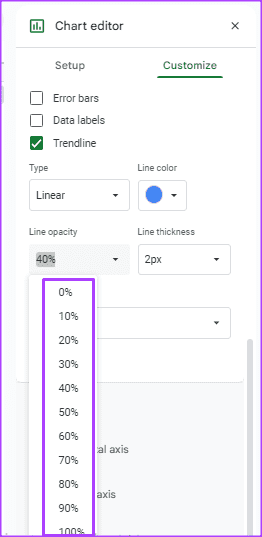
Step 3: Click the drop-down beneath Line opacity to customize the trendline’s visibility on the chart. You can choose from options between 0% and 100% opacity.
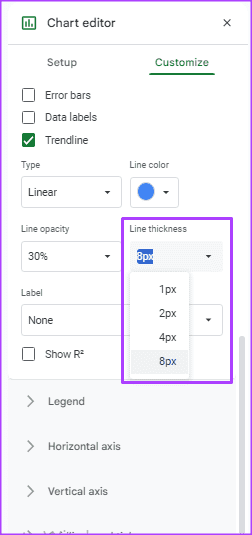
Step 4: Click the drop-down beneath Line thickness to customize the thickness of the trendline. You can choose from 1px, 2px, 4px, or 8px.
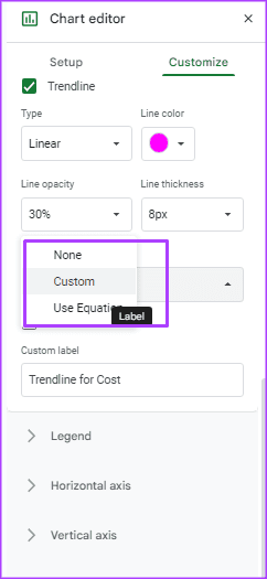
Step 5: Click the Label drop-down to add a label to your trendline. You can choose between a Custom label or an Equation label.
Was this helpful?
Last updated on 08 July, 2024
Read Next
 How to Add and Customize a Pie Chart in Google Docs
How to Insert Pie Charts in Google Docs There are two methods to add a pie chart in Google Docs.
How to Add and Customize a Pie Chart in Google Docs
How to Insert Pie Charts in Google Docs There are two methods to add a pie chart in Google Docs.
 3 Ways to Add Dates Automatically in Google Sheets
Method 1: Automatically Enter the Current Date Let's start by automatically entering today's date using the Google Sheets date function called TODAY().
3 Ways to Add Dates Automatically in Google Sheets
Method 1: Automatically Enter the Current Date Let's start by automatically entering today's date using the Google Sheets date function called TODAY().
 3 Ways to Add or Remove Gridlines in Google Sheets
Method 1: Add or Remove Google Sheets Gridlines From View Menu The easiest way to remove or add gridlines from Google Sheets is using the View menu.
3 Ways to Add or Remove Gridlines in Google Sheets
Method 1: Add or Remove Google Sheets Gridlines From View Menu The easiest way to remove or add gridlines from Google Sheets is using the View menu.
 2 Best Ways to Import Questions Into Google Forms From Google Sheets
Typically, when you create a Google Form, you need to perform several steps.
2 Best Ways to Import Questions Into Google Forms From Google Sheets
Typically, when you create a Google Form, you need to perform several steps.
 How to Insert a Date Picker in Google Sheets and Google Docs
Google Sheets and Google Docs provide a free, online alternative to Microsoft Office, along with unique features.
How to Insert a Date Picker in Google Sheets and Google Docs
Google Sheets and Google Docs provide a free, online alternative to Microsoft Office, along with unique features.
 How to Add, Customize and Delete a Text Box in Microsoft Word
Like in Microsoft PowerPoint, you can add a text box to a Microsoft Word document.
How to Add, Customize and Delete a Text Box in Microsoft Word
Like in Microsoft PowerPoint, you can add a text box to a Microsoft Word document.
 Top 8 Ways to Fix Google Sheets Won’t Let Me Type or Edit Error
Google Sheet allows users to collaborate on a single spreadsheet without needing to save anything.
Top 8 Ways to Fix Google Sheets Won’t Let Me Type or Edit Error
Google Sheet allows users to collaborate on a single spreadsheet without needing to save anything.
 How to Get Dark Mode in Google Sheets
Method 1: Use the Dark Mode - Night Eye Browser Extension (Desktop) The Dark Mode - Night Eye browser extension offers a promising way to get dark mode in Google
How to Get Dark Mode in Google Sheets
Method 1: Use the Dark Mode - Night Eye Browser Extension (Desktop) The Dark Mode - Night Eye browser extension offers a promising way to get dark mode in Google
The article above may contain affiliate links which help support Guiding Tech. The content remains unbiased and authentic and will never affect our editorial integrity.