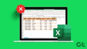
Excel is a powerful tool for data analysis, but it can be difficult to analyze vast sheets of statistics and figures when every cell looks the same. Conditional formatting aims to fix that problem by automatically adjusting the colors or visuals of cells based on their content and the surrounding context. This guide explores how to use conditional formatting on Excel.
What Is Data Analysis With Conditional Formatting in Excel?
For those who haven’t used this feature before, conditional formatting is a feature that lets you automatically change the appearance of cells across your Excel spreadsheets according to preset or customized rules. You can, for example, configure any cells containing a figure of 90 or more to turn green, or add a flag icon to tasks that are past their due date.
There are many different ways to work with conditional formatting, especially in terms of data analysis. It allows users to quickly visualize patterns or trends across vast sets of data by making instantaneous adjustments to cell appearances. If you have a sheet of sales data for a particular year, for example, you can use conditional formatting to quickly see top-performing months or weeks.
How to Use Conditional Formatting on Excel
While conditional formatting can take time to master, due to the many different rules and options it offers, it’s quite a simple feature to start working with. Here’s how:
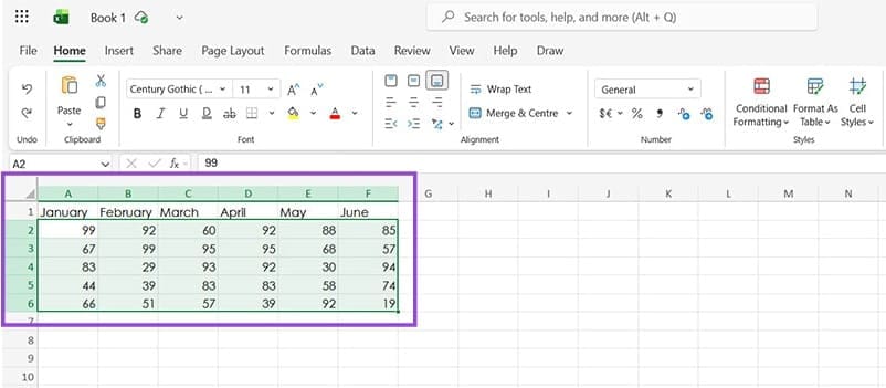
Step 1. Open the Excel spreadsheet you want to work with, and highlight the cells you wish to format.
Step 2. Click on the “Conditional Formatting” button, which you can find in the “Home” tab of the ribbon.
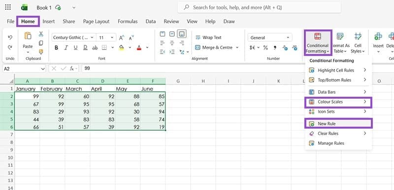
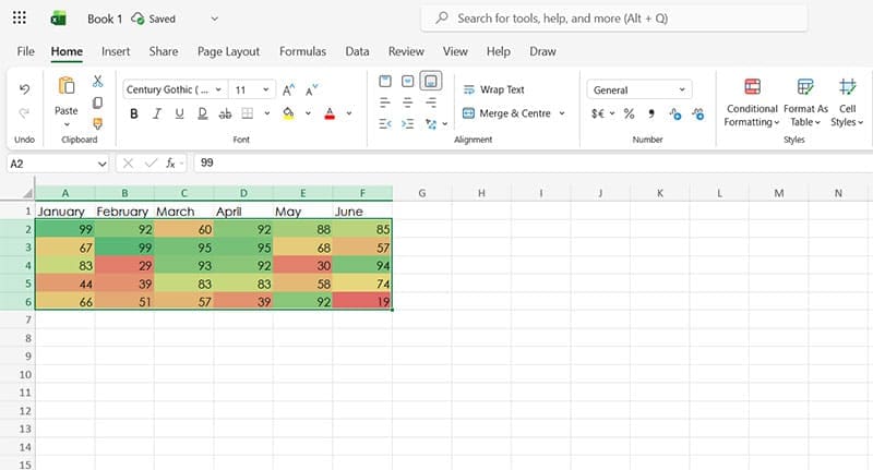
Step 3. Select from the available formatting rules or choose “New Rule” to make your own. For the purposes of this example, we’ll apply a “Color Scale” to the data, which automatically colors the cells using a gradient from red to green, with higher numbers marked green and lower numbers red.
Types of Conditional Formatting to Use for Data Analysis
As stated above, there are many different ways you can work with conditional formatting to change the appearance of cells. These include:
Highlight Cell Rules
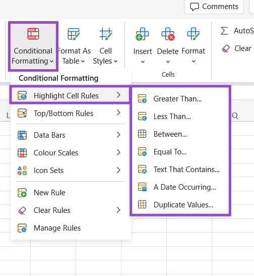
This lets you apply formatting to cells based on factors like how big or small their values are, whether the values fall into a specific range, or if certain words or phrases are present in the cells.
Top/Bottom Rules
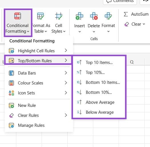
This is a helpful formatting option for finding the peaks and troughs of your data, letting you highlight the top or bottom 10 values, for example, or highlight any cells that are above the average of a set.
Data Bars

This formatting option adds horizontal bars to your cells as a visual representation of their values in relation to the overall set.
Color Scales
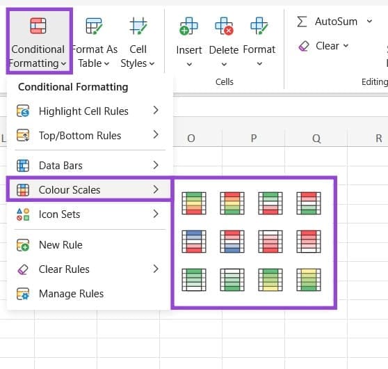
This lets you apply heatmap-style color coding to your Excel cells.
Icon Sets
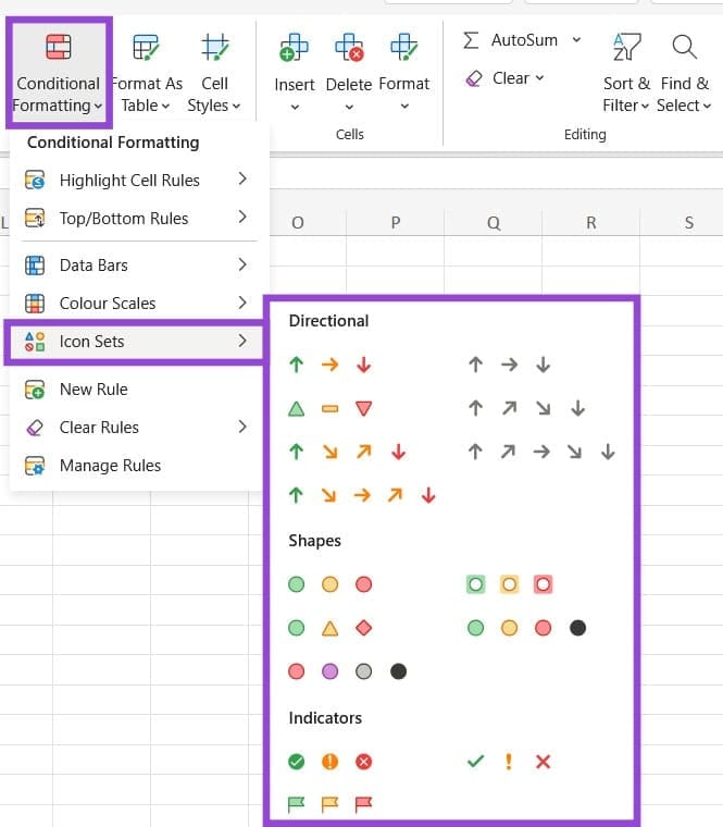
Finally, this formatting option allows you to add icons to your cells if they meet certain criteria, with options like arrows, shapes, and indicators, such as checkmarks or “X” marks.
Was this helpful?
Last updated on 14 January, 2026
Read Next
 14 Essential Microsoft Excel Functions for Data Analysis
1.
14 Essential Microsoft Excel Functions for Data Analysis
1.
 Three Clever Formatting Tricks to Try in Microsoft Excel
Spreadsheets shouldn’t be dull and dry — if you want people to read them, that is.
Three Clever Formatting Tricks to Try in Microsoft Excel
Spreadsheets shouldn’t be dull and dry — if you want people to read them, that is.
 Stale Value Formatting in Excel – What Is It and Why Does It Matter
If you’ve just started using Microsoft Excel, you might get used to the program automatically applying any changes and recalculating cell results for all formulas inside a datasheet.
Stale Value Formatting in Excel – What Is It and Why Does It Matter
If you’ve just started using Microsoft Excel, you might get used to the program automatically applying any changes and recalculating cell results for all formulas inside a datasheet.
 How to Add Conditional Logic to Google Forms (And Cool Tricks)
It's true that the attention span of the new-age millennial is getting shorter by the day.
How to Add Conditional Logic to Google Forms (And Cool Tricks)
It's true that the attention span of the new-age millennial is getting shorter by the day.
 How to Remove Table Formatting in Excel
Method 1: Clear Table Style When working with data tables, Excel often applies predefined styles that include various formatting elements such as colors, borders, and fonts.
How to Remove Table Formatting in Excel
Method 1: Clear Table Style When working with data tables, Excel often applies predefined styles that include various formatting elements such as colors, borders, and fonts.
 16 Cool WhatsApp Text Formatting Tricks That You Should Know
Overview TrickResultBold TextAdd * before and after the textBold TextItalic TextAdd _ before and after the textItalic TextStrikethroughAdd ~ on both sides of the textStrikethroughMonospace FontAdd ` ` ` before
16 Cool WhatsApp Text Formatting Tricks That You Should Know
Overview TrickResultBold TextAdd * before and after the textBold TextItalic TextAdd _ before and after the textItalic TextStrikethroughAdd ~ on both sides of the textStrikethroughMonospace FontAdd ` ` ` before
 How to Use Text Formatting on Reddit Using Markdown Mode
How to Format Text on Reddit: Basic Text Formatting in Markdown Mode We'll show you how to add emphasis to your text, add a strikethrough, superscript, line breaks, headers, and
How to Use Text Formatting on Reddit Using Markdown Mode
How to Format Text on Reddit: Basic Text Formatting in Markdown Mode We'll show you how to add emphasis to your text, add a strikethrough, superscript, line breaks, headers, and
 4 Ways to Clear All Text Formatting in Microsoft Word
Method 1: Using Keyboard Shortcuts With keyboard shortcuts, you can clear the text formatting within a Microsoft Word document.
4 Ways to Clear All Text Formatting in Microsoft Word
Method 1: Using Keyboard Shortcuts With keyboard shortcuts, you can clear the text formatting within a Microsoft Word document.
The article above may contain affiliate links which help support Guiding Tech. The content remains unbiased and authentic and will never affect our editorial integrity.